Picasso Exhibition at the Tate Modern

20180909_160909

So let me be honest I’m somewhat cynical when it comes to abstract art but one of the reasons for taking this course is to broaden my understanding so when I saw that the Tate Modern was exhibiting some of Picasso’s work I decided to put my cynicism to one side and check it out. Now I know Picasso could paint realistically when he was in his teens and took a different path later so it was easier for me to think this guy CHOSE to paint and draw this way.20180902_102442

First thing that did surprise me was the variety of approaches in his work and the scales he worked in. From sculpture to paint to pen and ink he explored many methods to communicate his ideas and I was interested in the way he used shapes of colour against contour lines as colour was not always bordered by line in a some of his work.20180902_103120

20180902_103125

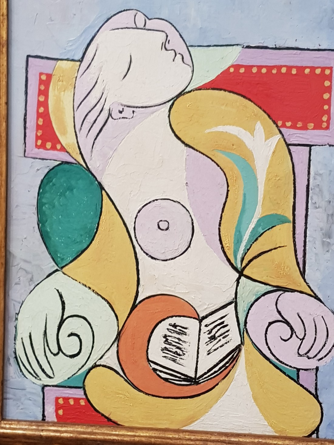
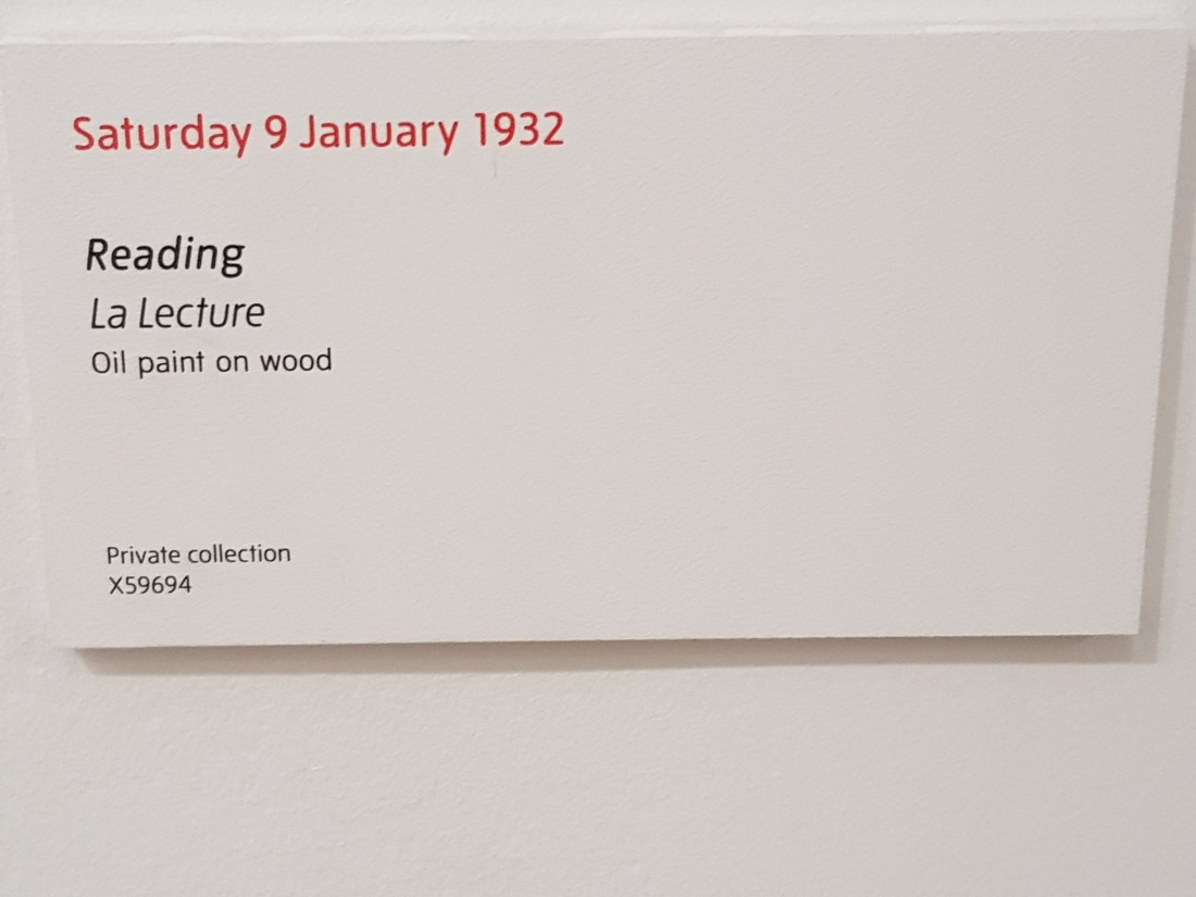
The second thing that surprised me was the thick almost crude brushstrokes with which the paint was applied. What I enjoyed most about “Reading” pictured above were the flowing lines Picasso used.I can see how a more angular line would give a totally different feeling to the picture. 20180902_10324420180902_103254

Woman in a red armchair interested me as it showed the use of light and shadow to  show form giving the shapes a feeling of three dimensions not felt in “Reading”

There was so much I could include from the exhibition but the last example is from a Picasso charcoal drawing20180902_10524220180902_104925

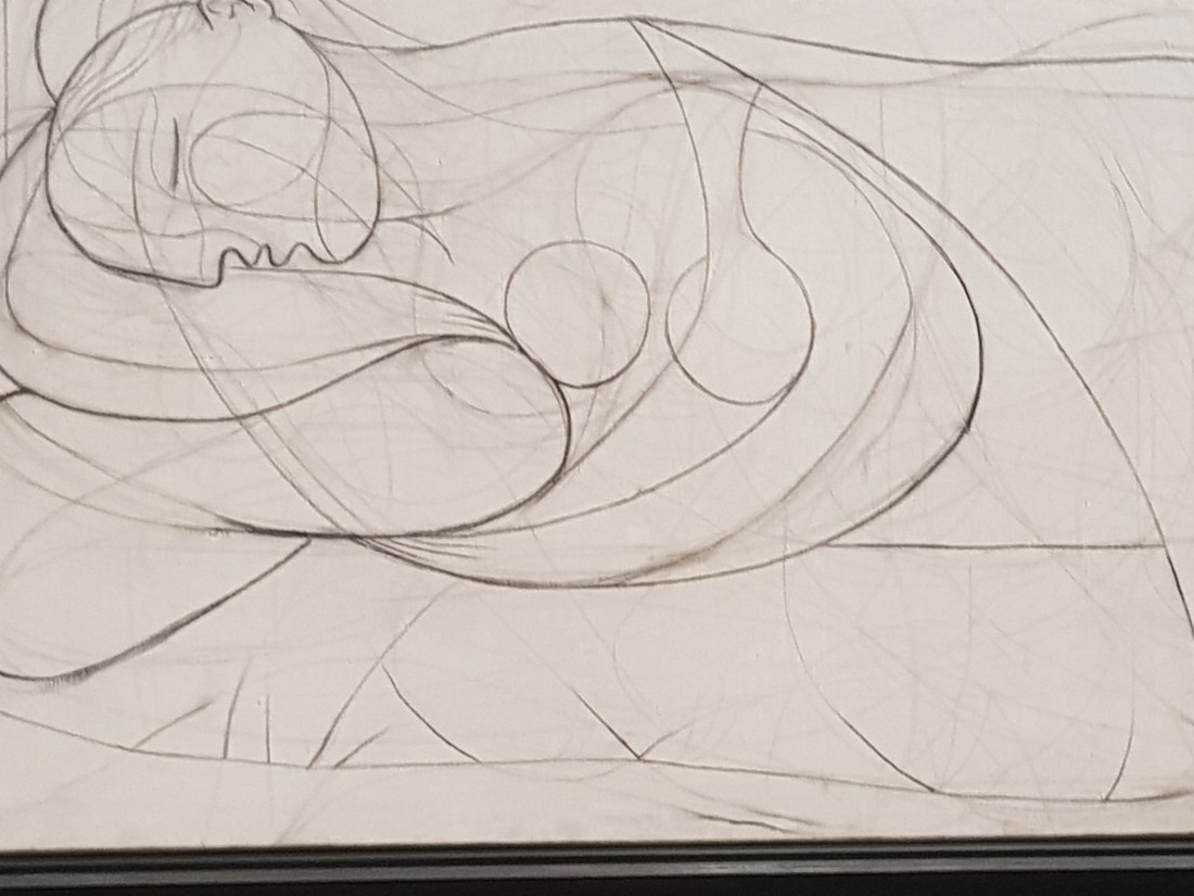
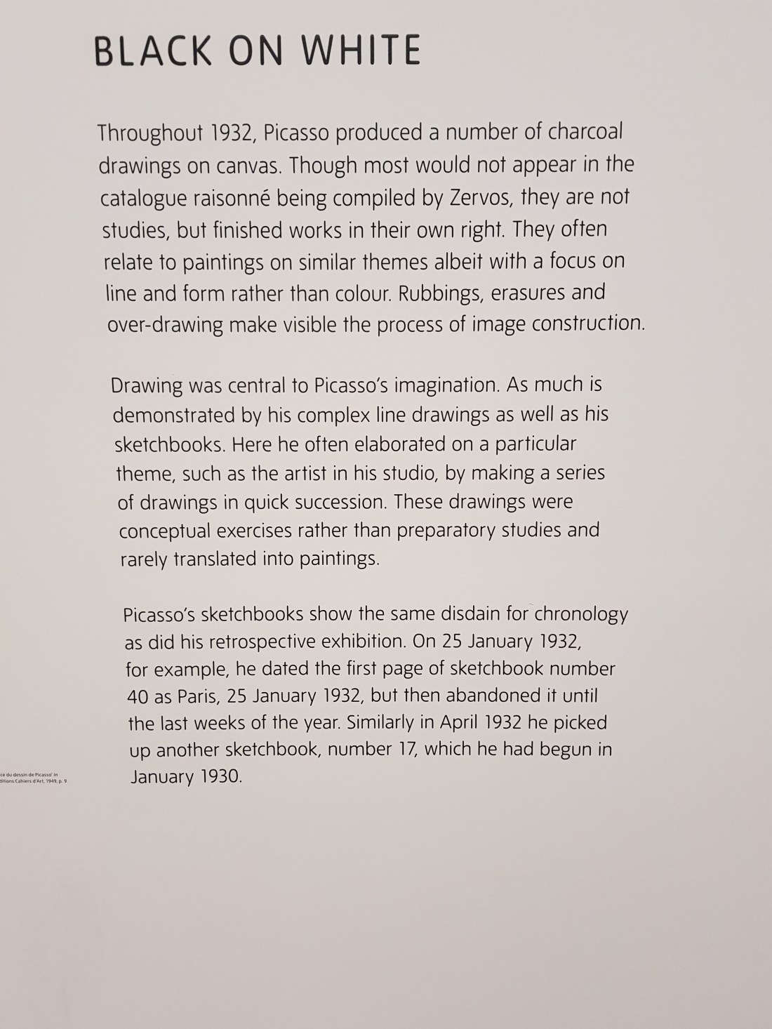
It was interesting to see where he had pursued on line to then discount it and try another. Reinforcing the idea posited  by E.H. Gombrich in the introduction to his book The Story of Art  regarding what an artist is concerned about when planning a picture is “has he got it right” (page 13, Gombrich, E.H. The Story of Art 14th ed. 1984). What is right for the artist may not be right to the observer.

In summing up I enjoyed the exhibition and came away with some new ideas. I noticed some similarities in some of Picasso’s work with comic art mainly solid black lines and flat blocks of colour. Have I changed my mind about modern abstract works …hmmmm…I’ll get back to you later in the course with regards to that.

Exercise 2 Experimenting with mark making and texture.(Continued)

Back again still experimenting with texture.20180909_16073920180909_160816

I’ve been practising with oil pastel and found a useful video on youtube

and I enjoyed playing with the sgraffito technique the most.

The problem I’ve found with oil pastels are the stray flakes that are produced effecting areas on the surface I don’t want them to. I will continue practising with them and have purchased another brand to see if the flakiness is still a problem.

Starting Exercise 2 Experimenting with mark making and texture.

I started experimenting with frottage and found a lot of different textures at work and home.

20180828_20034320180828_200349

I tried pastel, hb pencil and charcoal for these experiments and found pencil gave the best definition. There were some interesting patterns on the wall of my car tyre somewhere I would never normally have looked. The concrete reminds me of a lunar landscape seen from above or maybe alien skin. I found that I enjoyed discovering textures this way and if I can recreate them using other media I can see how this practice could give my mark making far more scope.

I began collecting a couple of items with different textures namely coffee granules and a fluffy knitted jumper to begin experimenting with  and wasn’t overly happy with the results.

20180828_200401


With the coffee granules I thought applying ink then sprinkling salt onto the ink pressing it into the paper and once the ink dried scraping away the salt would leave a granular pattern…it didn’t work I just ended up with a lumpy black shape. The pencil  line worked better but a little boring. The woollen fabric which had pulled threads in areas to give a fluffy texture was a little more successful and I think the white out over black ink was interesting as to me it seems to give an idea of layers better than pencil alone.

The black orange smudge was supposed to be the light and dark ridges of a woollen cushion cover but I soon realised that I need to understand pastel a lot better than I do at the moment. It does give a nice streaky effect when you smudge it though.

20180829_192958

Finally I tried a wood pattern, a plastic bottle and then just allowed myself a little playtime making marks. One set of marks I really liked was from dipping an old battered toothbrush into ink and the dancing the edge over the page it gives a crazy spiky almost grass like effect.

What Have I Discovered?

I need to learn more about pastel techniques to use them effectively and have discovered some useful tutorial videos on the web which I will study and practice this week.

I think frottage is a good way to discover new textures to incorporate into the work.

Experimentation can lead to unexpected results which may be useful later.

Exercise 2 part 4: Sadness

To me sadness is a dark emotion and I also wanted to hint at tears. Three of the panels were interesting one was not successful at all and I gave up on that particular panel to concentrate on the others.   The first panel I used charcoal to show a cloud of misery and added drips of water which I smeared down the page before adding some harder dots and dashes to indicate the uncomfortable nature of the emotion. The ink and stick actually worked out better than I thought it would. I tried to show the episode of sadness from start to finish and got really busy with ink spatters and lines in the middle to show the trauma that sadness can bring. I found the marker was too accurate to express an uncontrolled emotion like sadness and I moved on to soft pastel. I cheated a little here and used white out to indicate tears. I also noticed where I wiggled the pastel on the left side of the page a pattern indicating a series of bars emerged. That gave me the idea of sadness as a prison so I went back in and reinforced the lines making them bolder and implying a view looking down on a cell. sadness.jpg


Where to begin?

So I’ve started the course and am working my way through the 2nd exercise, so far so good. Now I need to decide on an artist to study and that’s when I started to worry. There are so many artists so many art movements will the first one I choose be a “good” artist will they be “worthy” will my selection impress others or alienate them? why does that question even bother me? These questions may sound ridiculous but I was having a real rabbit frozen in the headlights moment. That was until I discovered the helpful getting started study guides on the OCA website. Including the useful Looking at Artists guide www.oca-student.com/study-guides/looking-artists which pretty much answered all of my questions. If anyone  else is having similar problems or questions I hope this helps.

Exercise 2 Part 3 Joy

The emotion Joy made think of the idea of joy bubbling up and playful skipping lines.

The charcoal picture reminds me of an exploding party popper which wasn’t my intention but the more I look at it the more I see it.

The stick and ink drawing is far more bubbly but I’m not sure my use of the medium works it’s a little too scratchy.

The marker was interesting as I was using the soft brush-like nib to do the squiggly skippy lines the noise it made sounded like a squeaky giggle. I loved the idea of the pen “giggling” while I tried to indicate joy using line and got a little carried away putting lines in. I think it would have been better being left lighter in places allowing the bubbles to have more room.

The pastel was again using the bubbles of joy theme but this time coming through the darkness and technically I used two tools the pastel and a hard eraser to highlight certain bubbles.joy

Exercise 2 Part 1: Calm

I was apprehensive approaching this exercise coming from a more comic/cartoon approach to drawing trying something abstract like capturing emotion in a drawing is very much outside my comfort zone. I did,however, sign up for this course to improve my drawing and widen my experience of it so I steeled myself and boldly struck out into the unknown. The first emotion I decided to tackle was “Calm” with very mixed results.

Once I engaged with the feeling decided on what calm meant to me. A gentle smooth focus like a wave no sharp corners.  I chose a charcoal stick, stick and ink, a sharpie marker, and a soft pastel as my tools for this assignment.  In the main I believe I achieved this except for the stick and ink drawing which left me feeling anything but calm as I had precious little control over the tool I was using to apply the ink so gentle curves were out of the question. I decided to change my interpretation of calm to mean a single dot of focus in a sea of chaos…I don’t think it works very well but I did learn that a new medium can force you by it’s very nature to reinterpret your ideasex2Calm
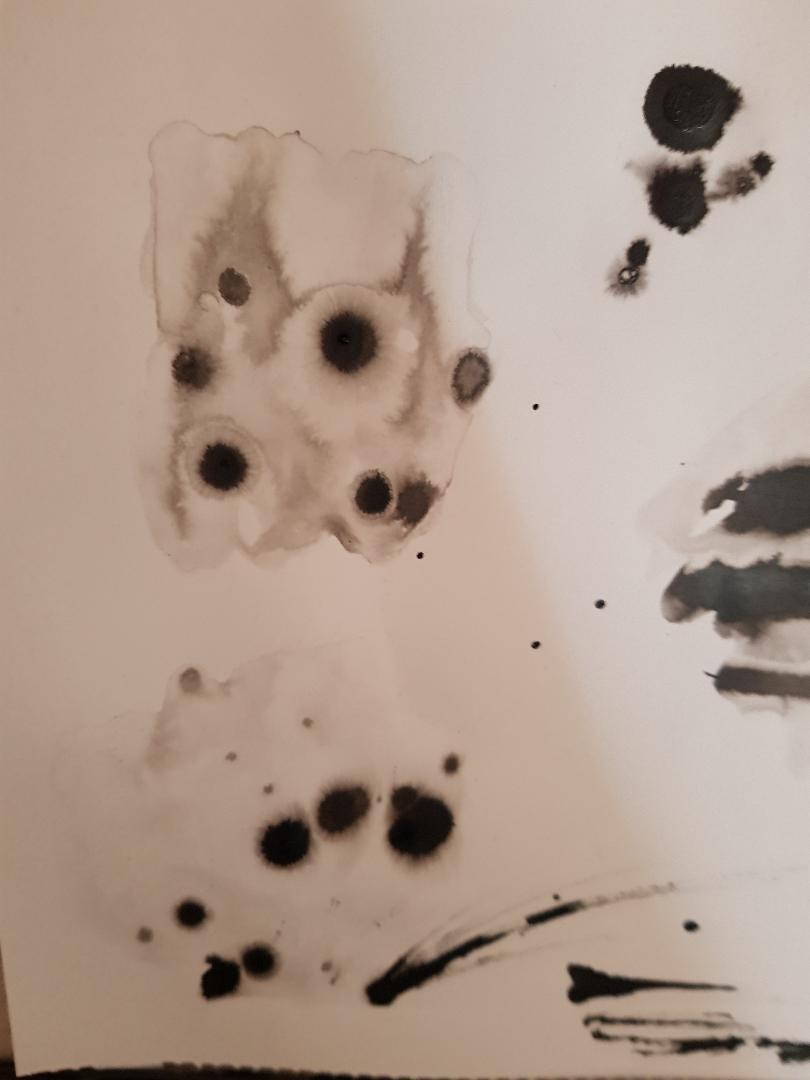
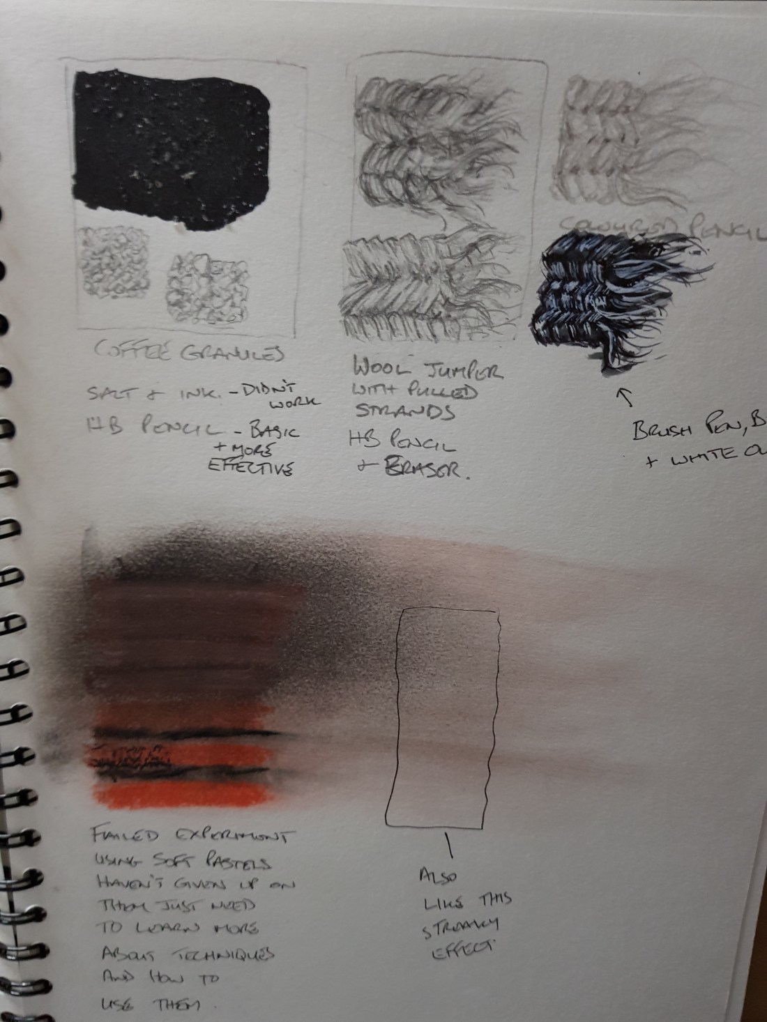
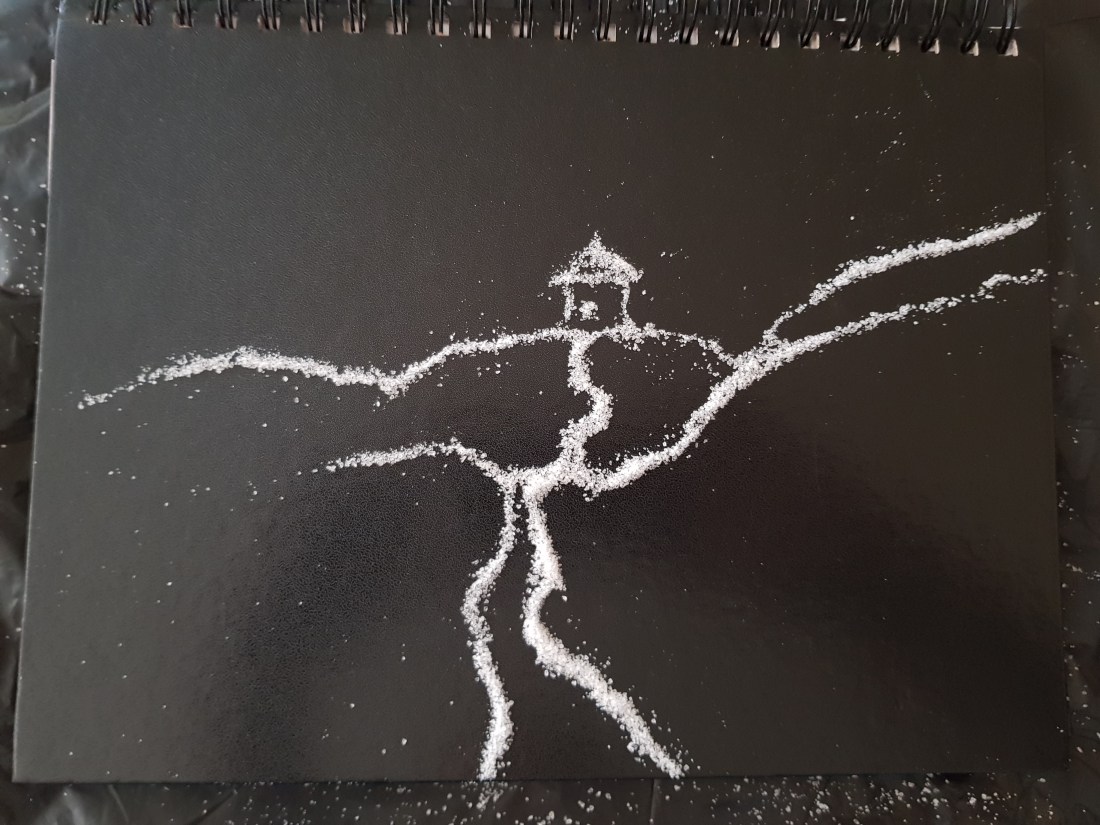
. I was happiest with the charcoal and pastel drawings as It allowed me to introduce soft tones into the work and to me soft (soft not weak) is another facet of calm.

Apart from the sharpie this is the first time for decades that I have used materials other than a pencil or pen and ink …it was fun.

I think I’ll tackle Anger next.

Exercise 1 Temporary Drawings

Before approaching this assignment I must admit I was stressing about what materials to use. In the end I settled on salt on the back of an old sketch book. I had fun pushing the salt around and soon found an image taking shape. It turned out to be a path leading to a house maybe indicative of the new path I have just started.

exercise1

I found not being invested in the outcome as it was only a temporary drawing interesting as it allowed me to enjoy the process more.