The last few months…

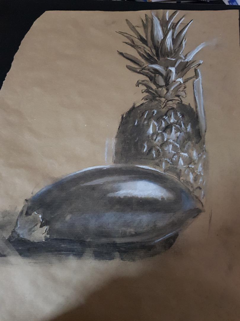
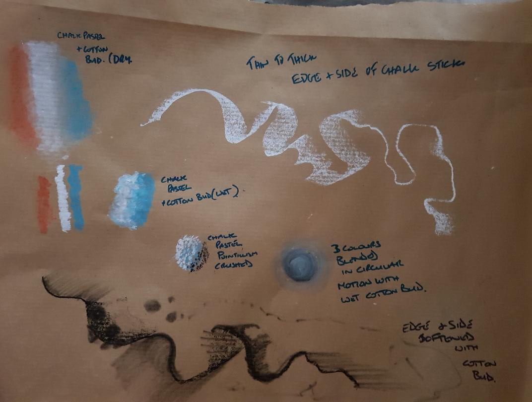
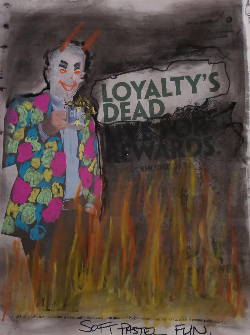
Last time I did anything for this course was in March this year this was due to helping my father battle cancer a battle which, I am sad to say, he lost at the end of July so between organising the funeral and being the executor of his will I’ve barely had time to grieve let alone work. I have found my tutor and the OCA very understanding and I will be asking for an extension to complete this part of the degree. You may ask why am I sharing this on my blog? I think it’s just to let others know that although I have fallen way behind on my schedule I am not giving up and say to those in a similar situation  it’s getting easier to cope with the new normal. So much so that I scribbled a poem this morning about some of my feelings and thought I’d share it:-

A simple act to close a door
I’ve done it countless times before
but simple acts can really mean
far more than it would often seem.

This house was home as I grew
with Mum and Dad and brother too
A place of comfort, love and care
where tears and laughter both were shared.

Far more laughter though than tears
filled the walls throughout the years,
Somewhere harsh words were seldom spoken
a space to mend when one felt broken.

For a home it seems to me
can be a living entity
and the most important part
is the love that lies within it’s heart.

But now with Mum and Dad at rest
there is no beat within homes chest
So one last time I close the door
of an empty house a home no more.

More mark making.

On the advice of my tutor I’ve carried on experimenting with mark making concentrating mainly on charcoal but with some deviation into soft pastels and ink.

20190218_164037

Charcoal crushed into pva glue,  smudged charcoal and white gouache. The crushed charcoal gives a wonderful textured black and reminded me of rocks and ash the white whilst it looks a little mountainy was actually me trying to express my emotions at the time I guess I was feeling a little “spikey”.

20190218_164050

Another approach to crushing charcoal this time powder directly onto paper.

More charcoal mark making.

20190218_164240

A3 drawing of an aubergine and a pineapple. Charcoal and white pastel on brown paper.

I thought the differences in texture were fun to play with and also the idea of losing detail as pineapple goes into shadow.

Found that using a cotton bud to blend charcoal almost feels like painting and allows really soft feel.

Going forward if I were to do this study again I would do several more smaller studies to explore the texture of the pineapple in more depth.

20190218_164146

A few soft pastel explorations.

20190218_164206

Using soft pastel over an online betting advert printed in the newspaper. The contrast between the soft pastel flames and the sharp edges of the pattern in the jacket was interesting to me. There are supposed to be gold coins falling from the mug (his cup runneth over) I also incorporated the Loyalty’s Dead blurb as it seemed to fit the images overall idea.

Reflection on tutors comments for Assignment 1

Well I’ve just got my feedback for assignment one from my tutor and found it very encouraging and thought provoking at the same time.

There are a lot of areas that have been identified for exploration. As suggested I have taken onboard the idea of being open minded forgetting the need the for perfection and let the drawing shape itself. I’m not saying I will find that easy but I am more than prepared to suppress my urge to get the work looking “right”. I’m actually excited about experimenting with materials, scale and materials worked and responding to the challenges thrown up by all of these factors the work progresses. Also the idea of having a conversation with the work is very useful although I have a feeling I’ll be arguing with the work a lot! Out of all the experimentation I wish to explore scale might be the most difficult  due to lack of  wall space to attach materials to and the presence of pets in the house making working on the floor problematic to say the least, however, I will endeavour to find a solution.

I will continue to experiment with materials and adding to my mark making  toolkit.

I agree that the camera has made photorealistic drawings almost obsolete and that   abstraction isn’t a bad thing. I do,however, find myself grappling with the following question “At what point does abstraction become less of an artistic choice and more about a way of hiding one’s technical shortcomings?”  Maybe the answer lies somewhere in another question ” What is Art?”. If Art is about communicating a feeling or idea then maybe the traditional notion of technical competence is not really required  as long as the finished piece does it’s job and conveys its meaning to the viewer. That being said if the viewer gets a different message from the work that the artist hasn’t seen has the artist failed? Which leads to yet another question “does the work need to be understood or can it just exist as a piece in it’s own right?” The work is what it is take it or leave it. I’ve gone off on a tangent here I guess what I trying to say is I like abstraction up to a point as long as the work makes me feel something. I love the work of a lot of comic book illustrators from the golden age of comics to the present day there are also comic book illustrators who leave me feeling nothing I’d much rather look at work by Wally Wood, or Alphonso Azpiri, both of whom work with abstraction to a degree, than I would Alex Ross who works in a much more photorealistic way but the results, to my mind, are dull and lifeless.witzend 01_pg20-21

Wally Wood

21f217e96a37e10fb1ad8215580a7233

Azpiri

thumbnail.asp

Alex Ross

I also find the work of German Expressionists exciting certainly not photorealistic but I feel myself reacting to the starkness of the images and the feelings of frustration and anger that I sense are held within them.

German-Expressionism-Adoration-Anbetung-Georg-Alexander-Mathey-Woodcut

That speaks to me far more than the Mona Lisa < a far more technically competent work, does. Give me the fun of anarchic “Lowbrow art” any day of the week.rw006_1024x1024

Robert Williams Pop Surrealist.

I also looked at a couple artists that were suggested for me to look at were Anita Taylor and Tacita Dean and I am still in the process of absorbing their work.  So going forward I will continue to experiment with materials and push them as much as my imagination and research will allow.  I’m aiming to see an exhibition a month and haven’t picked out February’s yet.


Drawing Skills: Reflection on Part 1:- Form and Gesture

Well that was a struggle! Looking back on before I started the course I had very little concept of the time it would take to get to this stage. There have been issues beyond my control for sure but I have to be honest and say the main delay in my progress has been a lack of organisation and discipline in getting the work done. The result in rushing over the last two weeks to get back on track leaves me feeling I have not done enough research or experimentation within the exercises.

My Sketchbook up until this point has been a chaotic shambles but from now I will organize it to be more in line with the coursework.

So taking the positives and moving forward I have discovered Organisation and Discipline are key. The last two weeks have shown me how much can be achieved if you just knuckle down to the work every evening. One of the things that helped me was moving my working space to where I could be more involved with the my family so I didn’t feel I was neglecting them. I now start my work at 6pm and aim to work for an hour although once I get into the task it could end up being two or three hours.

Also instead of working aimlessly in my sketchbook I think an approach more focussed on the exercises will help.

So after reading the assessment criteria this is how I think it went.

Assessment of Technical and Visual Skills.

Materials: I’ve tried some different materials and surfaces as well as familiar ones. These included Charcoal, graphite pencil, dip pen and ink, Brush and ink, marker pen, biro , soft pastel, oil pastel, correction fluid  and white gouache. Surfaces have included Cartridge paper, newspaper and recycled card.

Techniques: Techniques used included Hatching, Line, spattering, graffito, blending/smudging, dots and scribbling.

Observational skills, Visual Awareness and Compositional Skills: Not sure how I did but sure they need development. What does visual Awareness mean?

Quality of Outcome: All in all for the start of the course the quality is what I expected and will develop as I progress.

Demonstration of Creativity: Nowhere near enough experimentation with the mediums or exploration of the exercises. Still struggling with developing a direction for my personal voice hoping as I continue it will develop.

Context Reflection: Again not enough research or critical thinking. This learning Blog is was meant to be full of research already and that is something I have to work much harder on when dealing with the exercises.

Finally I’m actually happy I’ve managed the first assignment and look forward to hearing from my tutor on what is needed to move my work forward.

1st Assessment A3 cartridge paper pencil, charcoal, pen and ink, white gouache.

Well here we go after some genuine delays mixed with a generous helping of procrastination I have attempted the first assignment. My subjects were chosen as they all had different properties from square rough brick to soft cloth and from organic shell to manufactured reflective glass. My approach altered as the drawing took shape with the initial lay in done in pencil and some shading done with charcoal. I followed this with dip pen and ink trying to indicate form with the line as well as reinforcing the shadows. The next step was to go in with titanium white gouache to pick out lighter areas after tidying up some areas with fibre tip pen I spattered white over the image because … well honestly it just felt right and I wanted to.20190124_05124920190124_051311

I struggled a lot with the glass bottle and cloth. For me the real victory is getting to this stage.

Messing around with oil pastels

20190113_155046.jpg

Experiment with oil pastel using heavy blending and graffito techniques. I was really apprehensive using oil pastels as I haven’t had a great deal of success with them in the past. But this actually turned out ok and has given me some encouragement to persevere with them, The texture of the pastels matched the run down feel of the old pipeworks well.

Making Progress Exercises 3 & 4

Ok so after several minor breakdowns I’ve managed to get to the first assignment which I’m planning on tackling this week. So my work on the tonal mark making was a pretty mixed bag.

Exercise 3 various media in A4 sketchbook

20190113_155028

Used a variety of approaches here quite liked the short hatching and the dots.

20190113_155111.jpg

I decided to use a dip on the above image and apart from the perspective of the box being somewhat askew I found the use of hatching gave a very scratchy scruffy feel which worked well on the boot but less so for the glue bottle and box which were both very smooth surfaces.

Exercise 4 Shadows and Reflected light A2 Cartridge Paper, charcoal, putty rubber.

20190112_145848

20190112_145841

Reflective surfaces using charcoal and a putty rubber worked out better. Being able to lay in blocks of tone and then cutting into them with the putty rubber was a more satisfying technique than using hatched lines. Again the proportion was off on the mug however the exercise was to explore reflective surfaces and I think that turned out ok.

Ok on to the first assessment see you all soon and wishing everyone good luck in the new year.

Exercises 1 & 2

Exercise 1 Groups of objects. Two attempts both on A2 newspaper one using charcoal one using Blue oil pastel.

I managed to get myself twisted in knots over the course over the last month and achieved little, however thanks to the advice of my tutor and the encouragement of my fellow students I’m back on track. I’m posting a couple of exercises I’ve completed from Project 2. The first exercise I had a couple of goes at using newspaper to draw on. First of all with charcoal and secondly with pastel. I found using newspaper was liberating in the fact that it is so available and cheap that I didn’t mind taking chances with it  . On the flip side however it isn’t very robust and heavier use of the charcoal stick did result in a small tears. I also found that lighter lines get lost in the print which could be a benefit in some cases. There are also distortions most notable in the bottle i don’t know if that’s due to the newspapers lightweight texture and tendency to move as you apply pressure or the fact I’m not comfortable with the materials yet.

ex1

ex1a

I preferred the charcoal version but should have tried to put more detail in the bottle and tin labels. the other items were a denim jacket a book a cushion and an old work boot.

Exercise 2 observing light and shadow using blocks of tone A2 white paper, charcoal.

For project 2 Exercise 2 I have included a photo of the set up although the lighting was different when I began the drawing.ex2setupex2

Not accurate rendering of the items. The mug and bowl are both out of proportion and distorted, however, that being said I am happier with the tones and reflections in the bowl and to a lesser extent the mug. I found myself concentrating on whether I was looking at a reflection or shadow rather than light or dark and I think that approach was more confusing than helpful. Once I started looking purely for light and dark patterns it became easier.

Playing with ideas after exercise 1.

I decided to try and use the idea of mark making to add feeling to a picture and check out the results. I had the idea of depicting a punky character in a toxic environment and kept it simple. 20180909_160835

I used a piece of old card I found at work to add to the dystopian idea plus the fact it had some thickness allowed me to scratch into the surface adding to distressed feel. I used oil pastel, ink and correction fluid (I’ll use paint next time, the fumes from the correction fluid gave me a cracking headache!) I used the sgraffito effect to add some idea of light hitting areas of the characters top.

All in all I can see how the marks and choice of ground can enhance the mood of the picture and look forward to taking these ideas forward.